A Midcentury Daydream
Cloudhouse
By Atelier Davis
📍Atlanta, GA
Cloudhouse is a renovated 1960s home designed by Jessica Davis of Atelier Davis, a small design studio based in Atlanta, GA. Cloudhouse was one of 20 locations that opened their doors for tours during Atlanta Design Festival 2024.
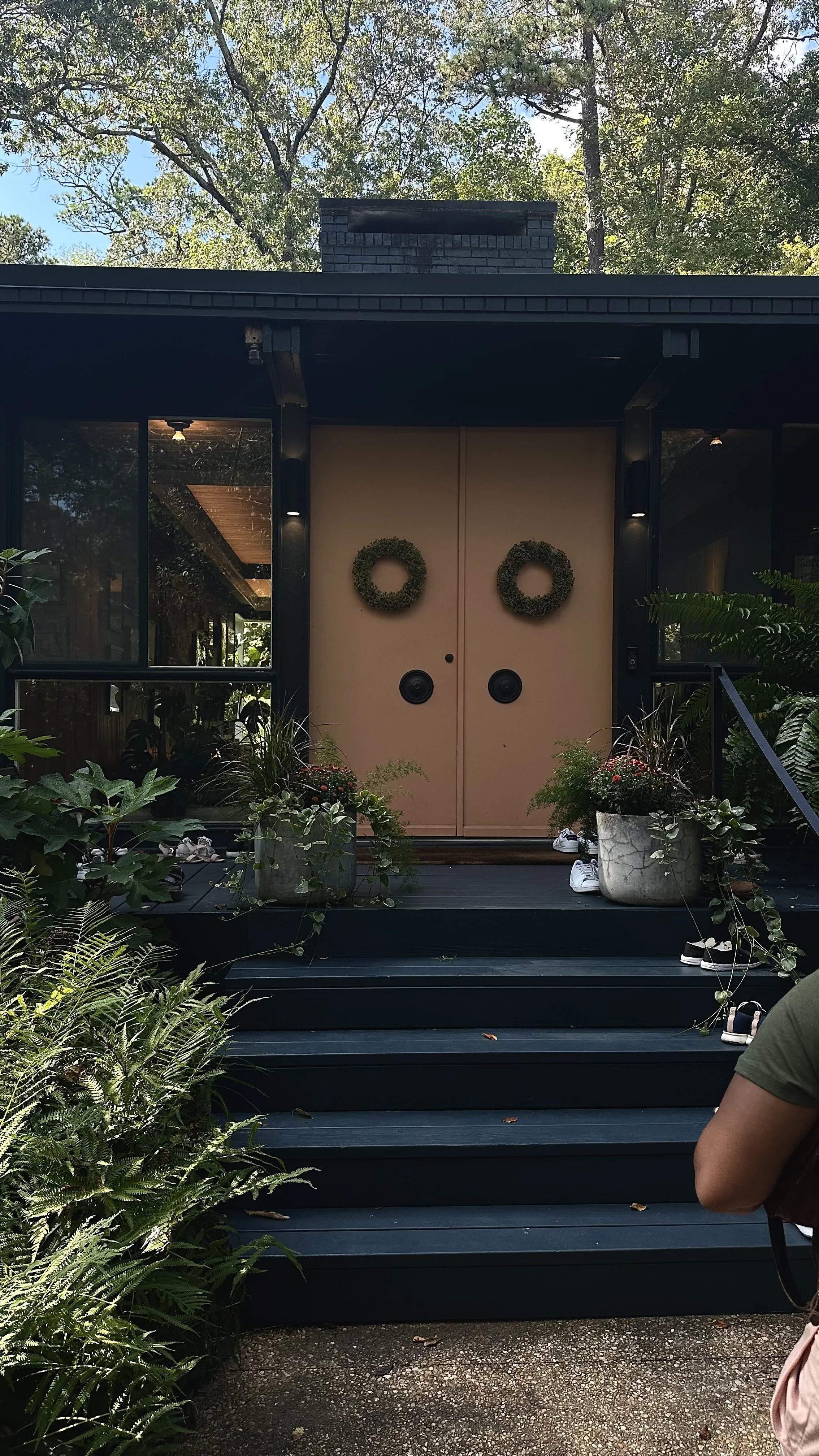
Though preview pictures of each location were listed on the Design Festival’s website, all I needed was to see the front facade of Cloudhouse to know that if I nothing else, I had to visit.
If not for the peach double doors and their dark knobs, the midnight blue skin on the home would be an L-shaped shadow nestled in the trees of Buckhead. The entryway is stacked with lush greenery, both potted and in ground.
Cloudhouse is a masterclass in design. It’s highly intentional and curated, but still feels lived in and warm. It bridges the space between magazine clean and kids live here.
Here’s four Design Techniques I observed that elevate the Cloudhouse aesthetic.
Statement Hall
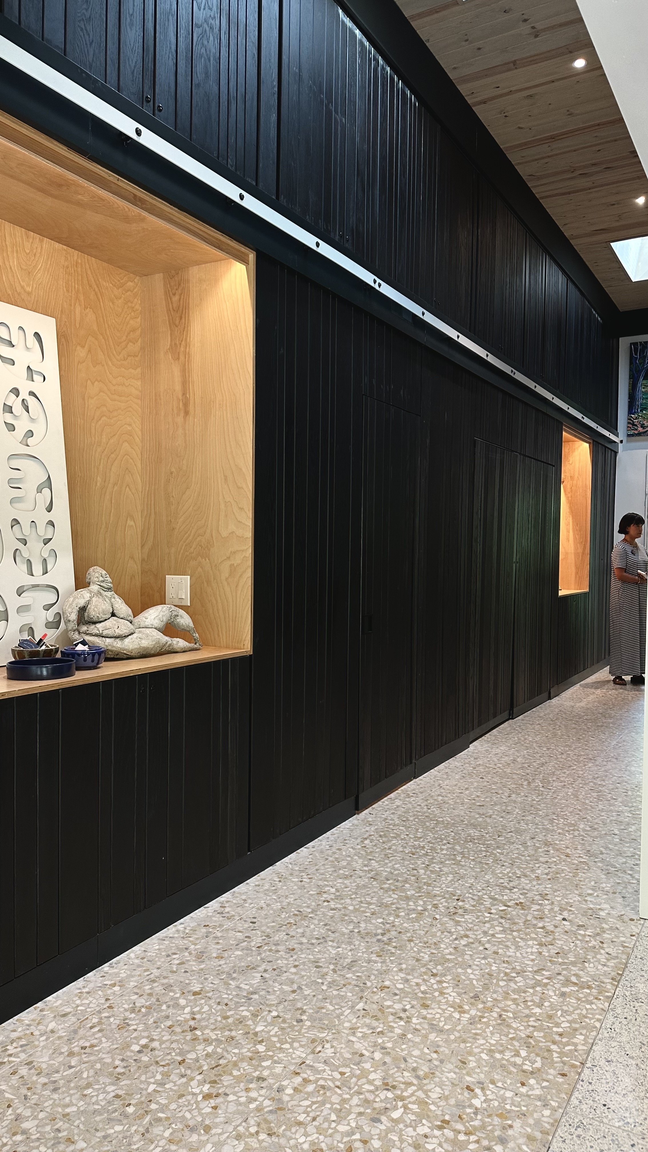
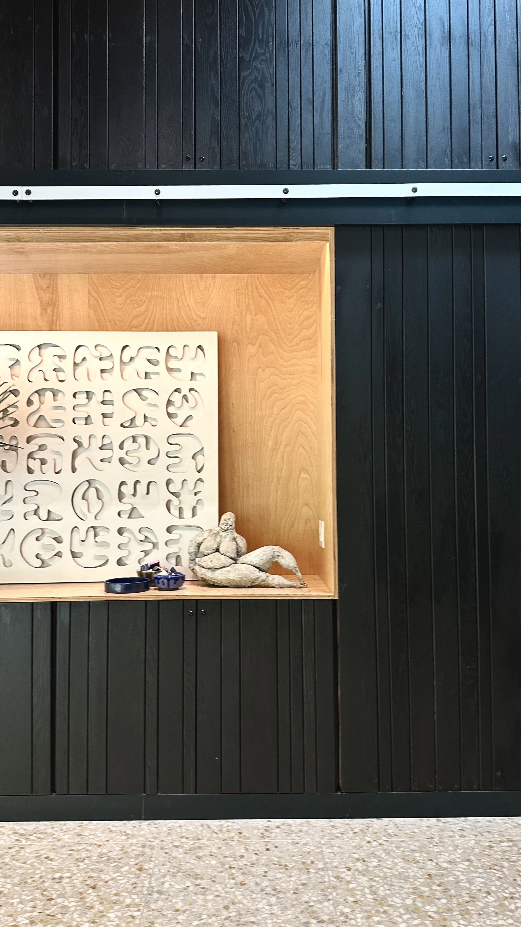
A dark wood-paneled wall lines the hallway that connects the kitchen at the front of the house to the den, bar and guest room at the back of the house. About 12-feet high, this statement hall is something you might see in a hotel lounge or luxury retail shop. Installing a wall like this in a residential space says “Our home life is exciting enough to warrant such a statement.”
The dark color is broken up by light wash, warm-lit recesses in the wall. I’m calling them art boxes. One features a stone figure sculpture, a matchbook collection and wood artwork by Esteban Patino, an Atlanta-based artist. The other has bookshelf and something like a bulletin board displaying childrens’ artwork, family photos and save the dates.
Ironically, the statement hall camouflages sets of doors that enclose a powder room and other secret cubbies.
While a main character of the home, only a portion of the statement hall is visible from the front door. It’s tucked away enough that the front room and kitchen can have their moment when someone first enters the home.
Personal Touch
Effective design addresses your needs and most of us need storage. Using your personal belongings as decor is a multi-layered design choice that, if done right, turns your space into a perpetual hug.
Three examples of personal touch in Cloudhouse are
open air storage
custom cabinet pulls
display of personal collections
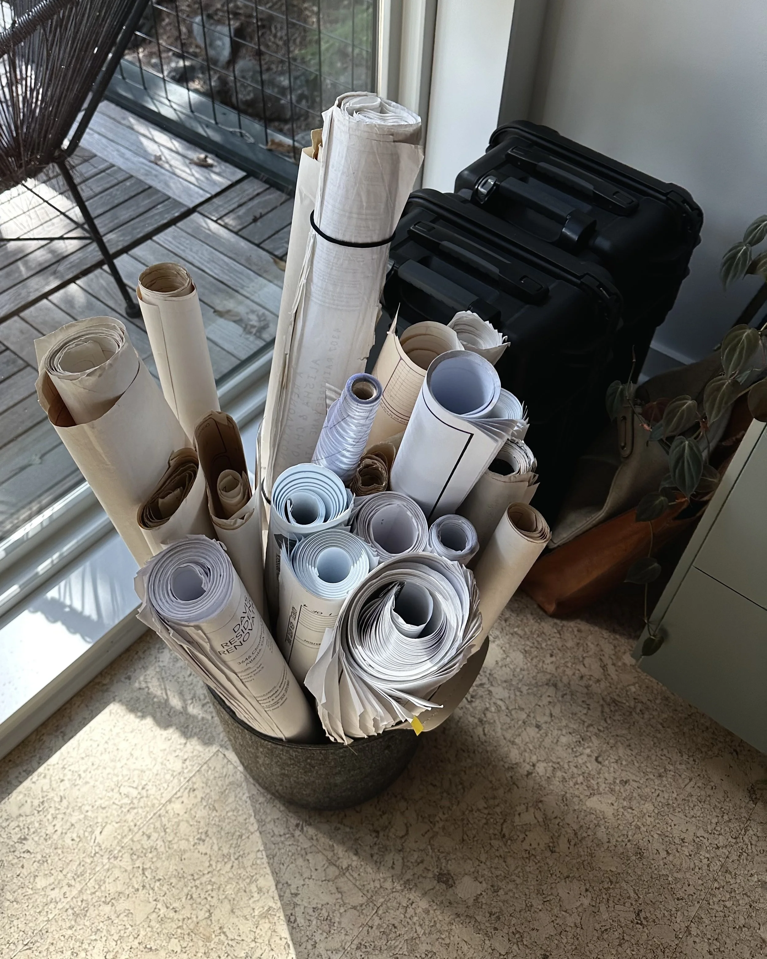
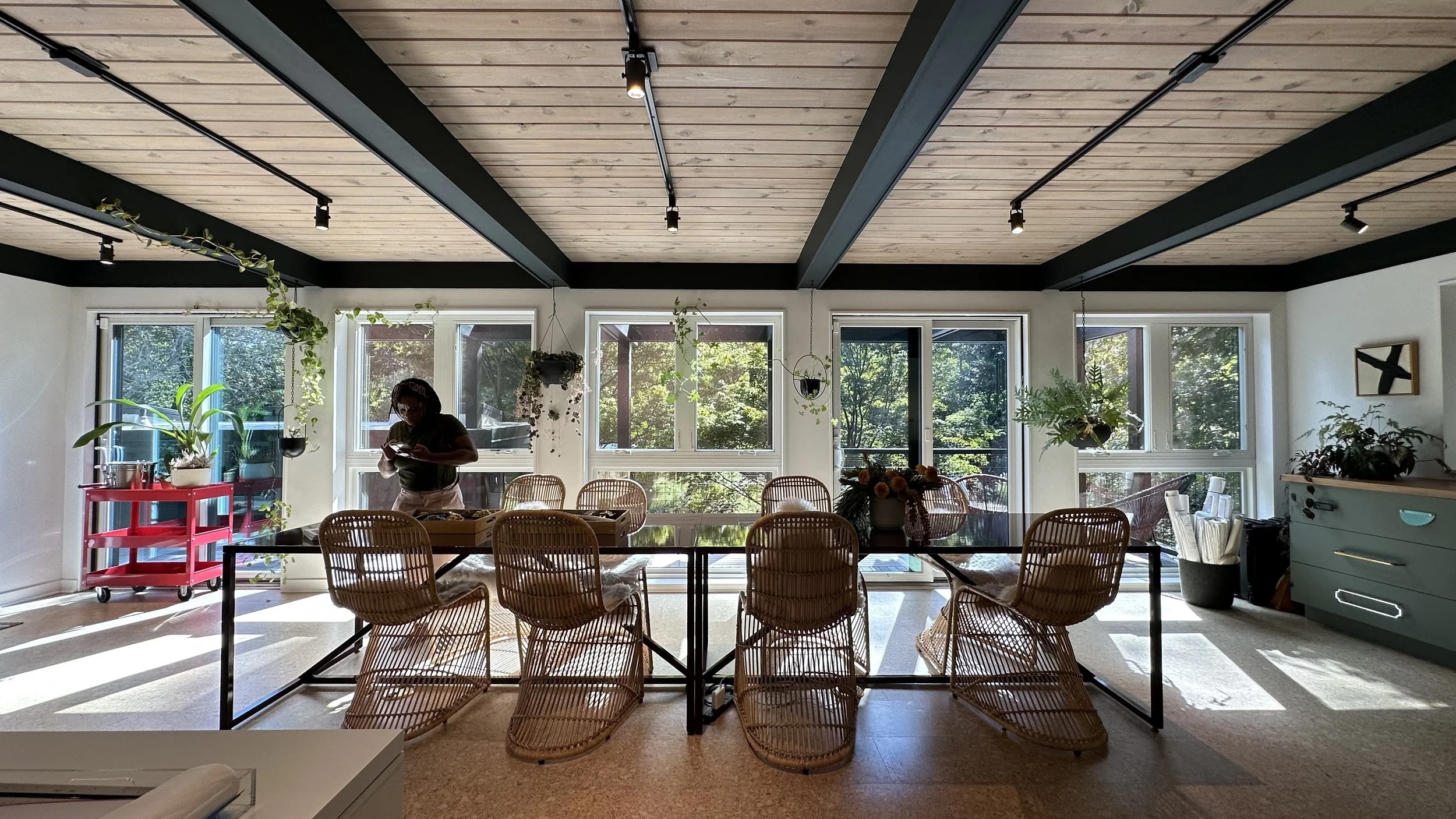
Open Air Storage. The upstairs sunroom studio, my personal favorite room in Cloudhouse, is where Jessica works, and perhaps where the other women of Atelier Davis occasionally meet. The studio features storm cloud blue cabinetry, an 8-person table and large windows that reveal an attached patio surrounded by trees. I noticed a bin of rolled up blueprints, presumably from previous projects. The bin is a point of visual interest and at the same time a practical design decision.
Some things are interesting or attractive enough to be stored out in the open. If you’re a woodworker maybe you display some of your hand tools or a collection of antique tools.
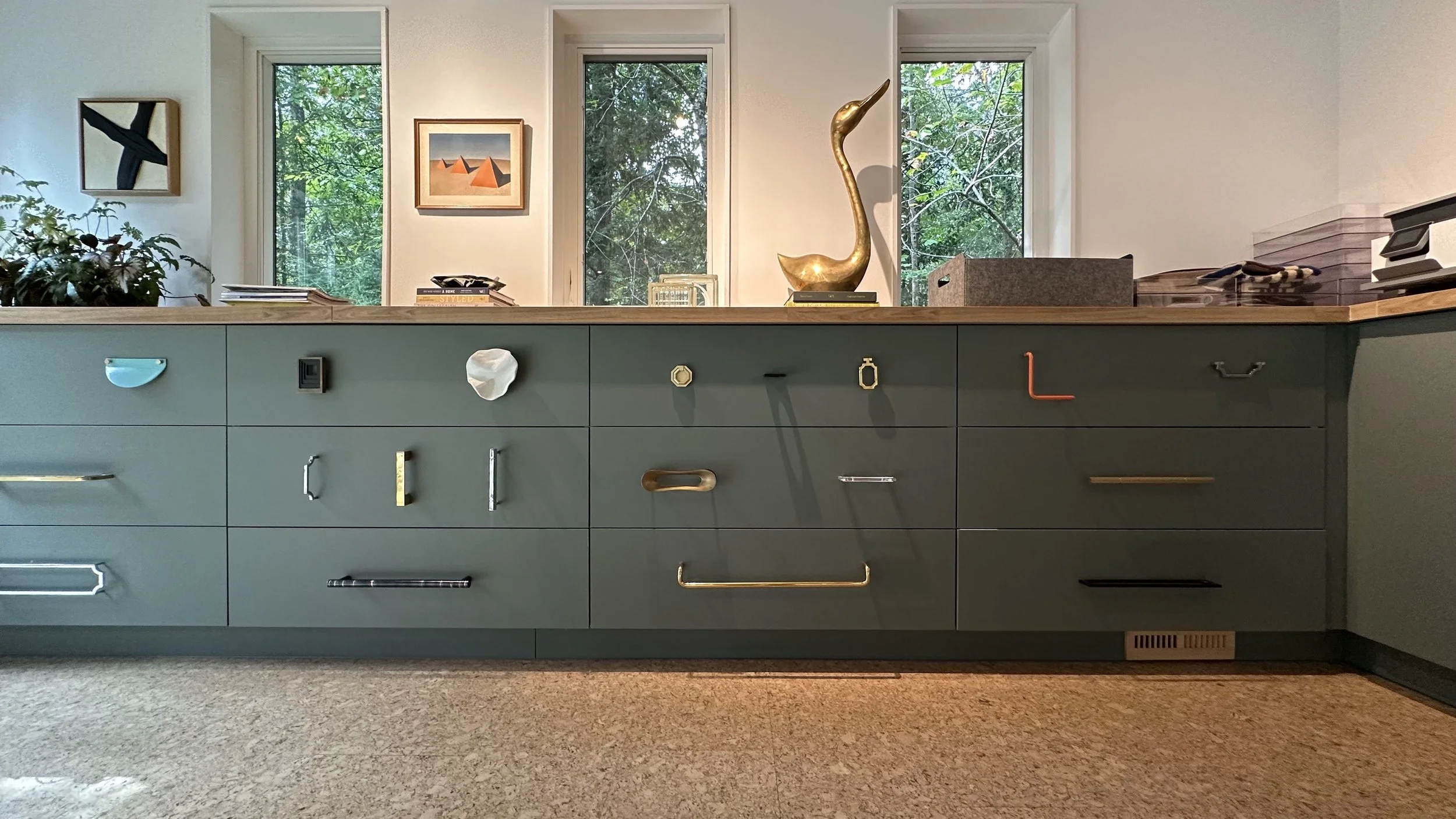
Custom cabinet hardware. Cabinet pulls are quiet opportunities to elevate your space. Drawer pulls can be classy and at the same time whimsical. They can make you smile. Nest Studio, started by Jessica Davis in 2012, designed the cabinet hardware throughout the Cloudhouse kitchen. Upstairs in the sunroom studio, every drawer has a unique pull. I noticed what looks like a silly face made from cabinet hardware.
Hobby Lobby is a great place to start if you’re looking for unique drawer pulls. You might also try a thrift store. There are, of course, plenty of online retailers like Nest Studio that carry cabinet pulls that complement a variety of aesthetics.
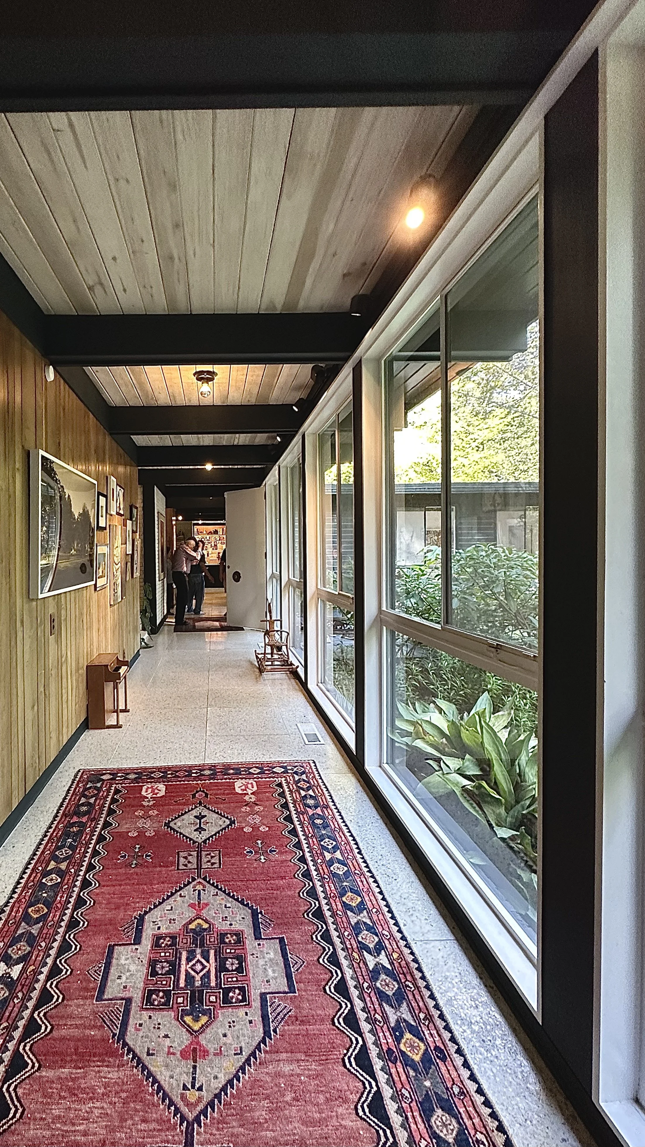
Display Your Collection. It’s likely that one of the Cloudhouse dwellers has a fascination with tiny perfume bottles. The window-lined hallway leading from the front door to the primary suite exhibits a set of mirrored shelves decorated with collectible perfume bottles. Perhaps the bottles got lost in the texture of the wood wall and inspired the mirrored shelves.
It’s not uncommon for people to feel intimidated when beginning to decorate their home. Start with the things you like and build from there. There’s no use in trying to mimic the home decor stores or the vignettes at Ikea. Those spaces likely won’t be compatible with you and your lifestyle.
Outside In
Just about every room in the house has large windows that create the feeling of being outdoors while indoors.
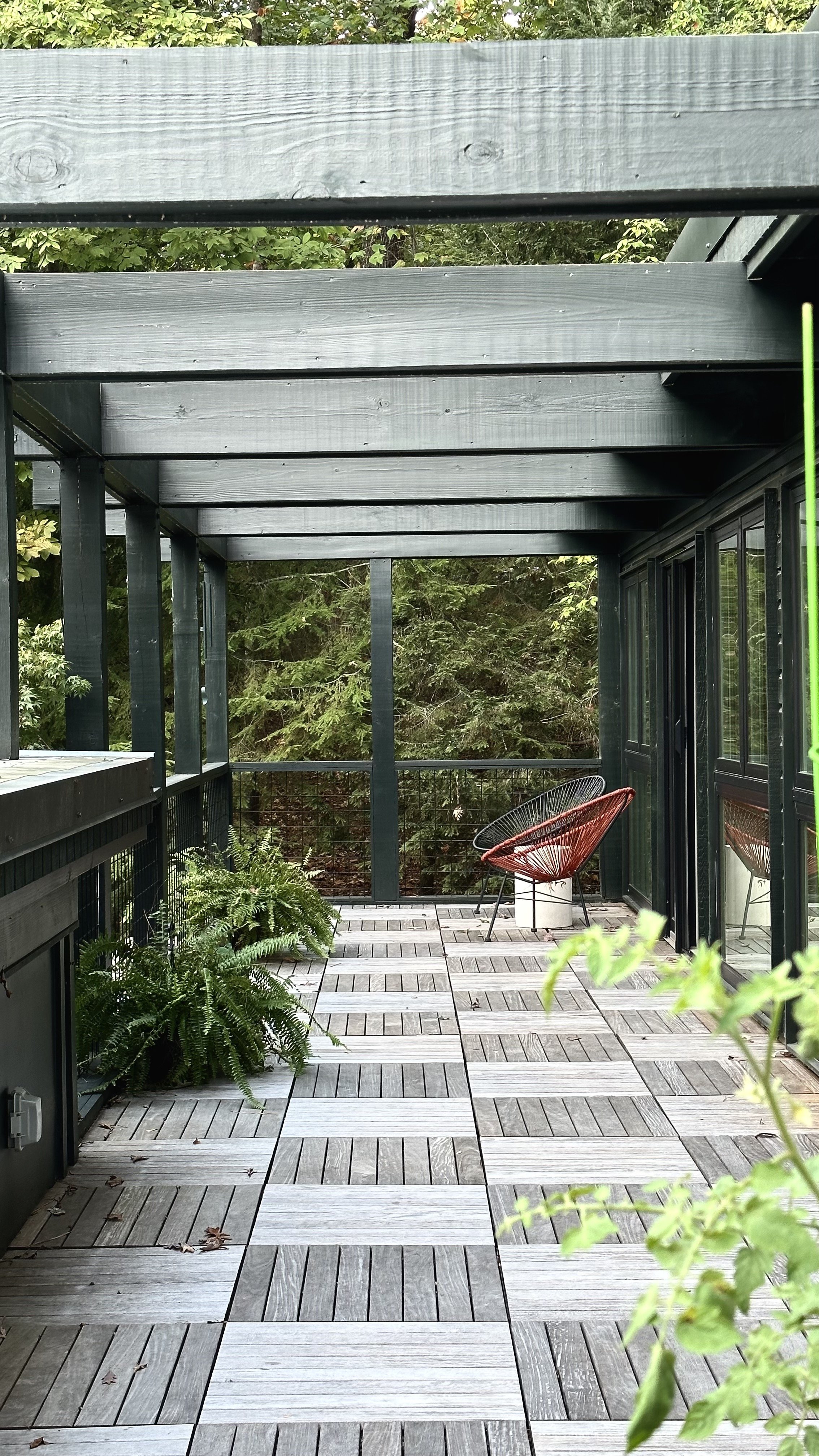
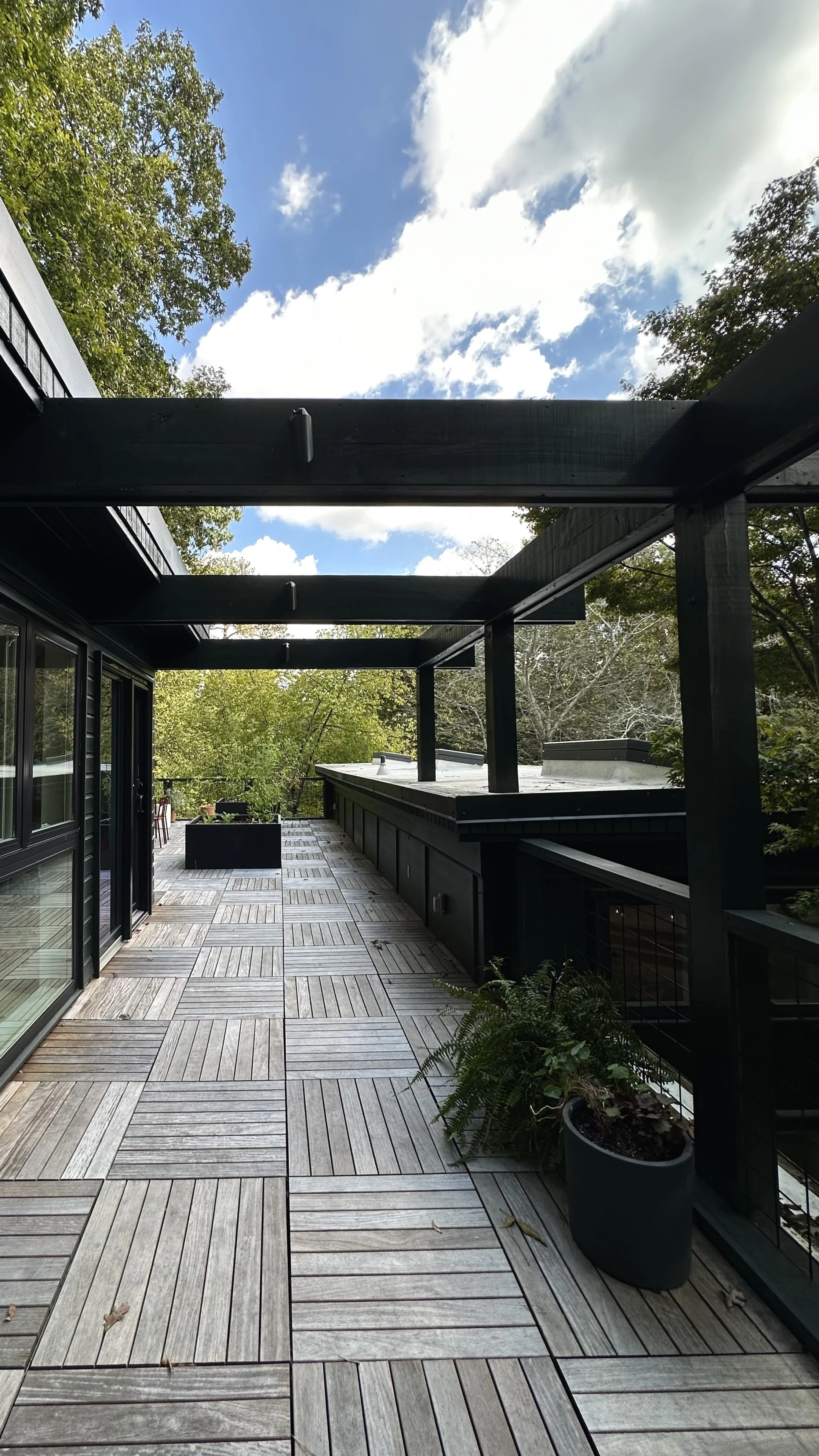
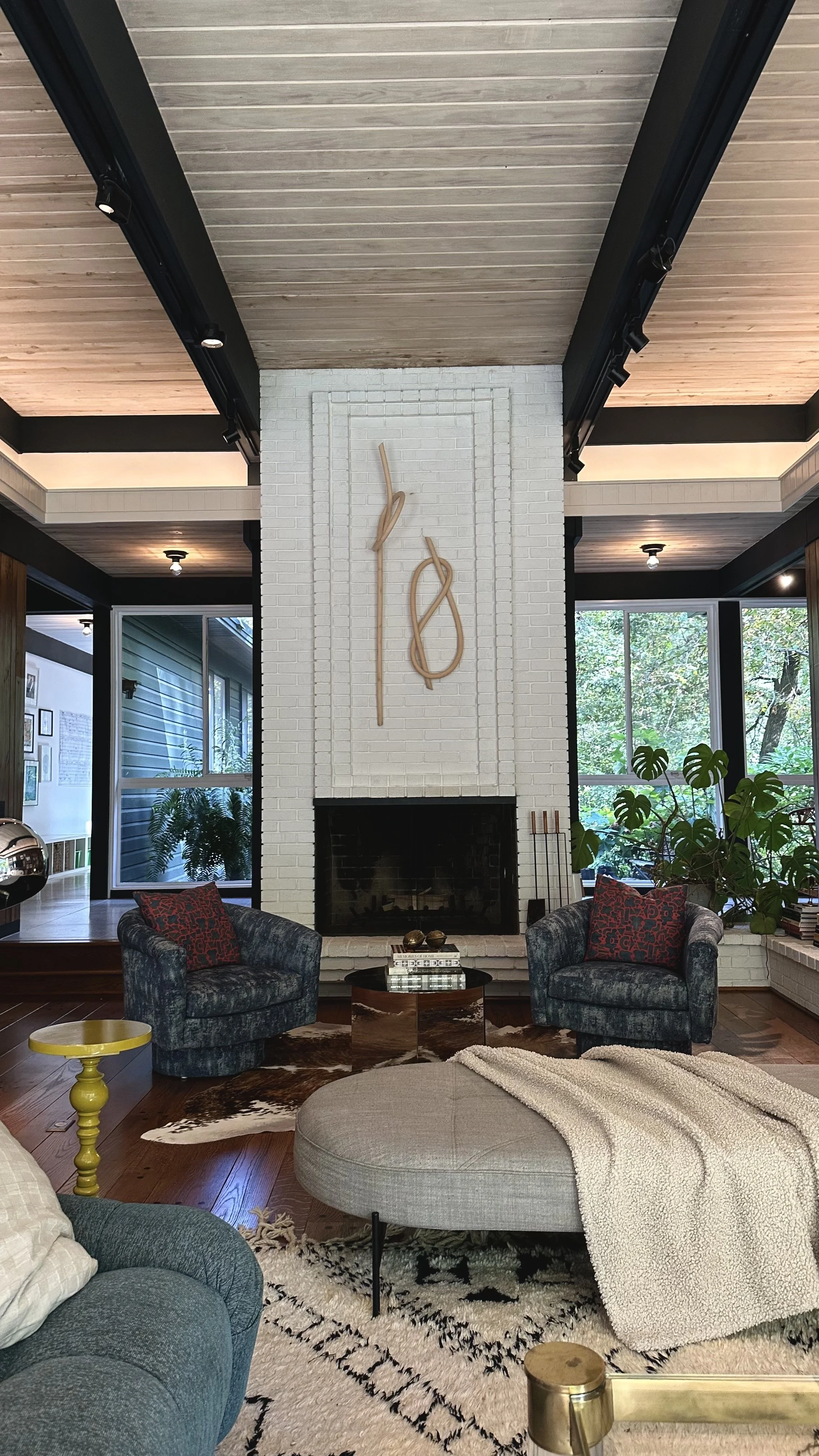
The exterior paint of Cloudhouse is where midnight blue and forest green meet. Exposed wood beams throughout the home interior are stained that color, creating a seamless conversation that flows between outside and inside.
Lighting
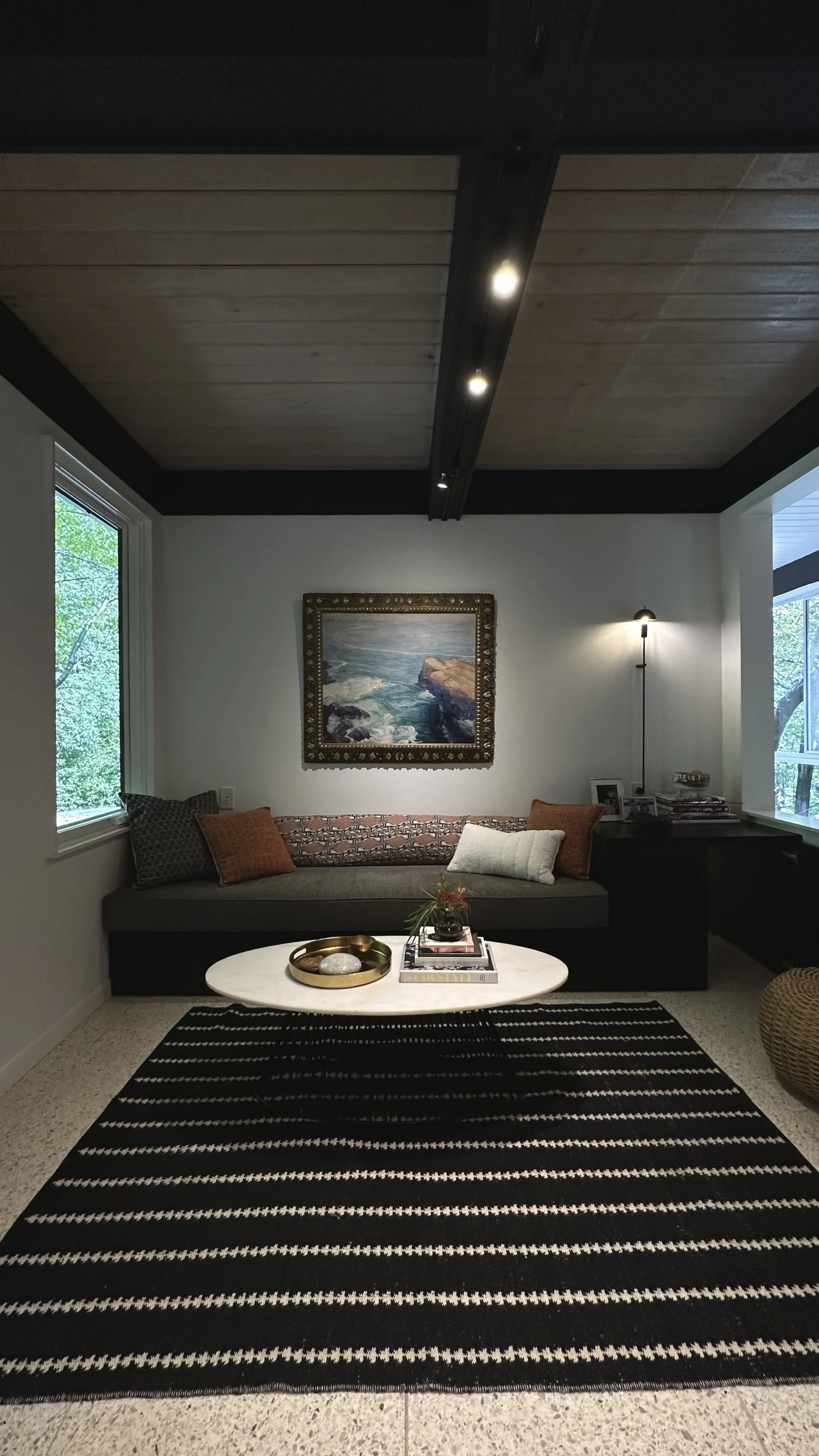
Notice in the photos that every room has lighting installed based on its shape and size. There’s not too many floor lamps or lighting fixtures throughout the space. Most interior light comes from outdoors and the rotatable spot lights on the ceiling.
Check out the video below to see Cloudhouse in motion. Notice the collection of art, artifacts, vintage finds and modern designs.


